Archangel

Archangel2

I was listening to what has to be one of the best records of the past few decades, Untrue, by Burial. For some reason I got inspired to make something to express how the music felt to me. The track features rolling UK garage rhythm, sampled choir and strings, and a haunting bassline.

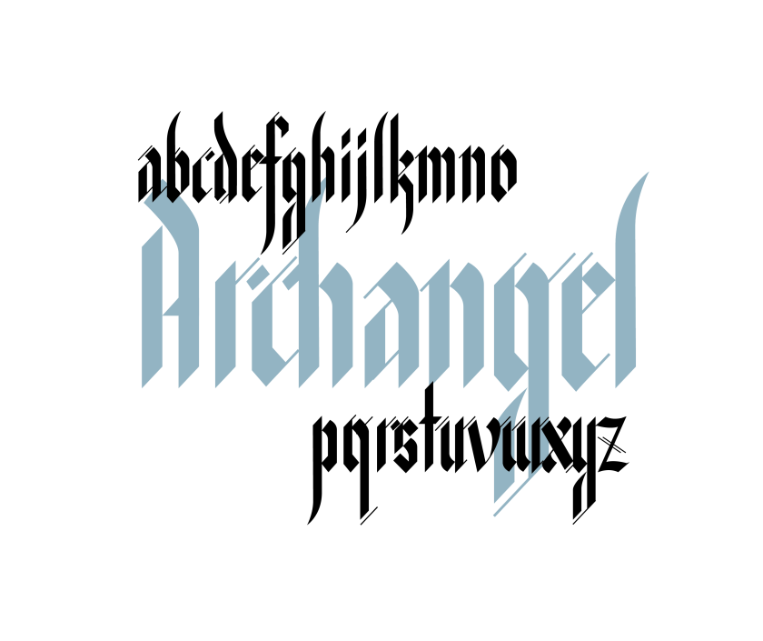
I chose to create a blackletter treatment of one of the track titles, Archangel. I started with the basic characteristics of the style, shallow angled flat-nibbed pen and perpendicular rather than curved letterforms. To complement the rolling, syncopated rhythms and staccato drumbeats, I broke up many of the letters, forming diagonal dashes, and made them tall and narrow with prominent ascenders and descenders.

Artboard 4 copy 2@3x

Near-darFor me, and I suspect for many others, the dark, timeless feeling of Burial’s music perfectly matches the associations people have with blackletter type. Blackletter fonts are often used to make something look old and rustic. But they are also seen as dark, sombre and even aggressive. It is favoured not only by beer brands and antique shops, but also by heavy metal musicians and rappers.

Their physical characteristics support this image. They appear black and heavy, with fractured and angular forms. These design features started out in the 12th century simply as practical innovations. The straight and perpendicular lines made it easier to write quickly and neatly on rough parchment, to serve the growing demand for books among an increasingly learned Western European readership.

It began to acquire its counter-cultural associations during the Renaissance, when the printing press allowed for a variety of styles to be produced just as quickly, and revival of Classical styles prompted the dismissal of Medieval styles as ‘barbaric’ or ‘Gothic’. Save for the persistence of blackletter in Germany as a proud marker of difference against the rest of Europe, the style fell out of mainstream use.

Blackletter was invented in response to a specific problem at a specific time. As a universal typeface for use in general typesetting, its days would always be numbered. But its physical features and its historical patina secures its place as a modern display typeface style. I think we’re seeing something of a revival of Blackletter in mainstream culture, as people become disillusioned with the idea of progress, and want to reconnect with a (real and imagined) cultural past. Other calligraphic styles have faded into mediocrity, being revived only to lend prestige, or to parody the olden days. However blackletter carries enough power not only to reconnect us to the past but also to make a serious, and relevant, statement about the present.

Branding a band: Trying things on

colours

Most music today is available on demand streamed through tiny electronic windows, while album art and live performances have been reduced to a tiny part of the experience. So projecting an image to listeners has become even more important.

But if you looked at my band, four middle-class, white guys from London playing slightly poppy alternative guitar rock, it was far from obvious what we could do to stake out our place among the millions of other aspiring guitar bands out there. Admittedly, we had largely defined ourselves in terms of what we’re not. Not metal, not fashionable, not punky, not angry, not ‘cool’. After a few years of playing together, Ollie, our former drummer, once called us the ‘Lib Dems of music’. Not exactly a flattering parallel.

The challenge is all the greater since band ‘branding’ is harder to pin down by necessity. Most successful alt-rock bands don’t have a strict ‘brand’ in the business sense of the word. They have a ‘zone’ which forms the basis for the visuals they choose to go with their music (think Strokes, with their retro video game stylings, or Radiohead, dwelling in their slightly disturbing Stanley Donwood universe). This is exactly what our band needed to find. Look too consistent and things end up looking corporate, no matter how playful you make it.

Over the five years we’ve played together, our look has lurched from one extreme to another. The survey below of the various identities we’ve given ourselves over the years reveals just how erratic this journey of partial self-discovery has been.

Colours for the Blind was the first name we really ran with. It’s evocative, but very grandiose. We were still getting to grips with writing our own songs, we were experimenting and trying out different musical styles, and we thought way too highly of our own efforts! Still, we had lofty ambitions for our creative project, and it’s fair to say the grand-sounding name and the operatic, showy visual style I paired with it reflected our naive and starry-eyed hopes.

another picture idea

I think, had we been experienced songwriters and had definite musical success, we could have worn this ‘look’ with no problem. After a couple of years, however, as we started to develop musically, and work with our limitations, we grew increasingly self-conscious of the mismatch. It was time to adopt a look which was more humble and paid more homage to our musical influences.

SnailBANDITS

Enter Snail Bandits: kooky and boyish, and in line with the tongue-in-cheek band name tradition that seemed to characterise our musical influences: Pixies, Pavement, Grandaddy. The look changed too. No more moody, operatic, multicoloured layering. We were going to be grungy, DIY, and a bit silly. We even came up with a hand signal (a fisted left hand on top of the right hand making a peace sign but with fingers held horizontally – a snail! Get it?). I won’t even go into the pixel art ideas.

But it was too much. We didn’t want to go that way. It was at around the four-year mark that we finally decided to try and record something properly, and our musical style really began to surface. It wasn’t kooky. It was contemplative and relatively slow-paced, with moments of dramatic ‘bigness’. It was at the same time we took this photograph. It looked cool and cinematic, and probably was the first visual thing where we all went ‘yes’.

sunny retouched

After one of the most intense rounds of name brainstorming we had had to date, we came up with… Fever Trees. Great name. So great it had already been taken – by a drinks company. Back to the drawing board, but now with a clearer idea of the kind of ‘feel’ we were going for. The assonance of the ‘Fever’ and the ‘Tree’, the slight mystique of the phrase. We followed this trail, and eventually settled on ‘Trees on Venus’

phones_photo_idea_notitle

Of all the ‘identities’ we’ve had, this feels pretty comfortable. It’s still got the slightly geeky nature of the Snail Bandits days – it’s just been pulled back a bit. There’s a slight sense of humour, but it’s not all-out irreverently punky. It feels like an identity we can ”wear’ comfortably and improvise around. From now on, when it comes to our ‘look’, hopefully it’s now a matter of evolution rather than revolution. We shall see…

Design a site like this with WordPress.com
Get started